Choose the best type of graph
key notes :
Understanding Graphs:
Explain that graphs are visual tools used to display information clearly. They make it easier to compare and understand data.
Types of Graphs:
- Bar Graph: Best for comparing quantities of different categories. Use when you want to show differences in amounts.
- Line Graph: Ideal for showing how data changes over time. Use for tracking trends or changes.
- Pie Chart: Useful for showing parts of a whole. It helps in understanding proportions or percentages.
- Pictograph: Good for showing data with symbols or pictures. It’s easy to interpret, especially for younger audiences.
Choosing the Right Graph:
- Bar Graph: Choose when comparing categories, like favorite fruits or animals.
- Line Graph: Use for showing trends over time, like temperature changes in a month or stock market prices.
- Pie Chart: Use when you want to display percentages or parts of a whole, like how a budget is divided.
- Pictograph: Choose for younger audiences or simpler data presentation, like the number of books read by students.
Factors to Consider:
- Data Type: Decide if you’re comparing categories, showing trends, or illustrating proportions.
- Audience: Consider the complexity of the graph. Simple visual graphs (like pictographs) are better for younger students.
- Clarity: Ensure the graph is easy to read and interpret, with appropriate labels, titles, and scales.
Learn with an example
🛑 Which type of graph would you use to show the average rainfall in a city every year for ten years?
- line graph
- pictograph
- stem-and-leaf plot
- bar graph
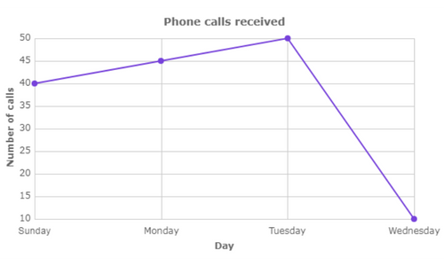
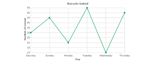
The best type of graph to show the average rainfall in a city every year for ten years is a line graph. It shows a value that changes over time. Example:
The other types of graphs are not as good.
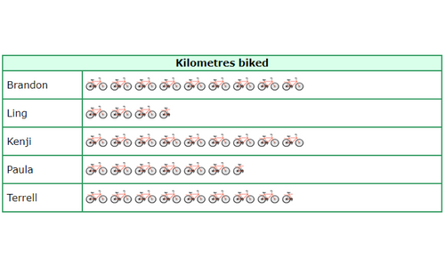
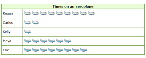
A pictograph compares two or more values that are multiples of a number. Example:

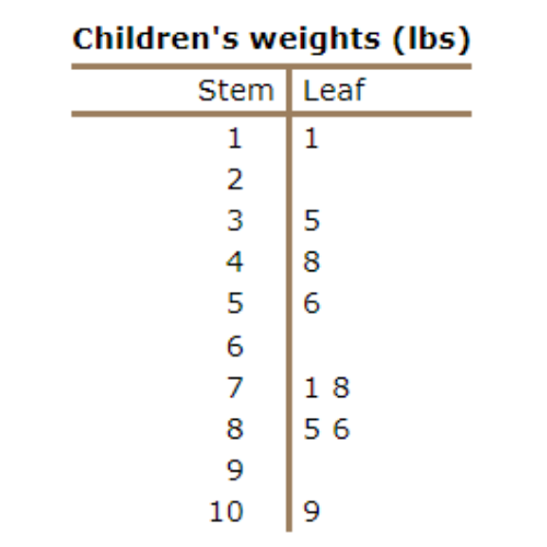
A stem-and-leaf plot shows the numbers in a large data set arranged by place value. Example:
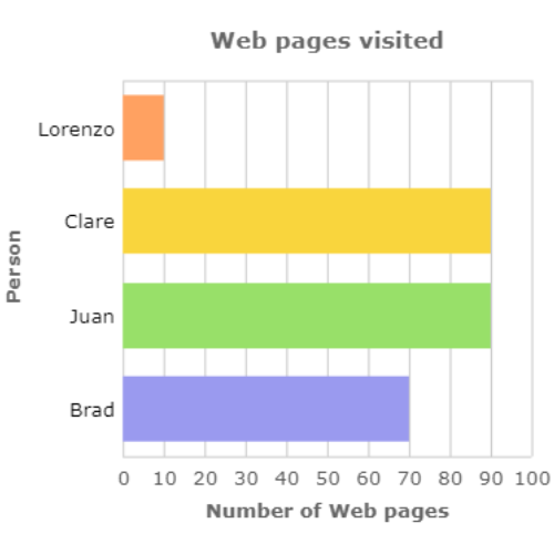
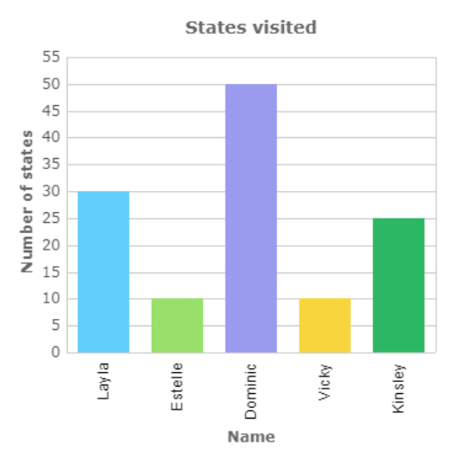
A bar graph compares two or more values. Example:
🛑 Which is the best type of graph to show the number of students in each class in the school district?
- stem-and-leaf plot
- bar graph
- pictograph0
- line graph
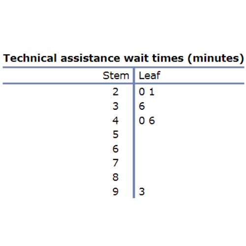
The best type of graph to show the number of students in each class in the school district is a stem-and-leaf plot. It shows the numbers in a large data set arranged by place value. Example:
The other types of graphs are not as good.
A bar graph compares two or more values. Example:
A pictograph compares two or more values that are multiples of a number. Example:

A line graph shows a value that changes over time. Example:
Let’s practice!🖊️