Create line graphs
key notes :
Definition of a Line Graph
- A line graph is a type of chart used to show information that changes over time.
- It consists of a series of data points connected by a continuous line.
Parts of a Line Graph
- Title: Describes what the graph is about.
- X-axis: Represents the independent variable (e.g., time – days, months, years).
- Y-axis: Represents the dependent variable (e.g., temperature, sales, scores).
- Data Points: Mark specific values on the graph.
- Line: Connects the data points to show trends over time.
Steps to Create a Line Graph
- Collect and organize the data in a table.
- Draw the X-axis and Y-axis and label them correctly.
- Choose an appropriate scale for the Y-axis.
- Plot the data points on the graph.
- Connect the data points using a line.
- Give the graph a title.
Interpreting Line Graphs
- Identify trends (e.g., increasing, decreasing, constant).
- Compare different data sets if multiple lines are present.
- Use the graph to make predictions based on past trends.
Uses of Line Graphs
- Tracking changes in weather, population, or stock prices.
- Measuring growth in sales or business performance.
- Recording student progress in test scores over time.
Common Mistakes to Avoid
- Not labeling the axes correctly.
- Using an inconsistent scale.
- Not connecting the data points properly.
- Misinterpreting the trend shown in the graph.
Learn with an example
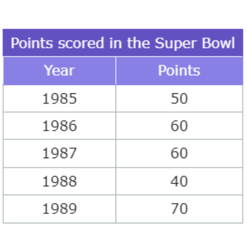
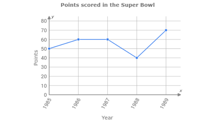
⚫ Two fans looked up the number of points scored in past Super Bowl games.
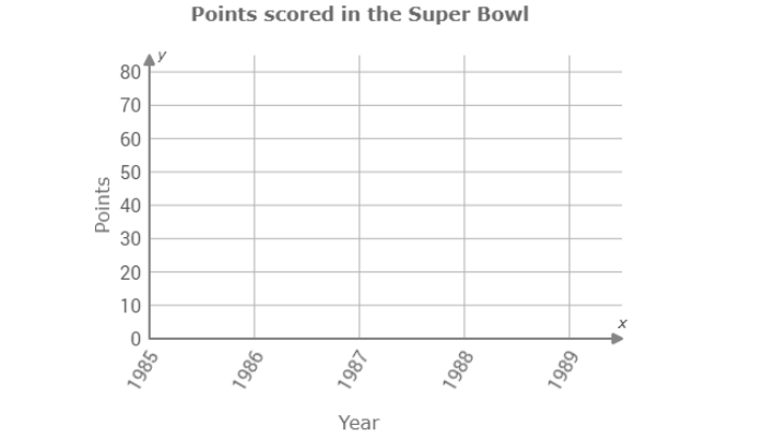
Use the data in the table to complete the line graph below.
Click to select points on the graph.
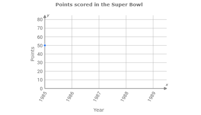
Look at the first line of the table. The first data point is for 1985. 50 points were scored in 1985. Above 1985, click on the line for 50.
Now look at the second line of the table. The second data point is for 1986. 60 points were scored in 1986. Above 1986, click on the line for 60.
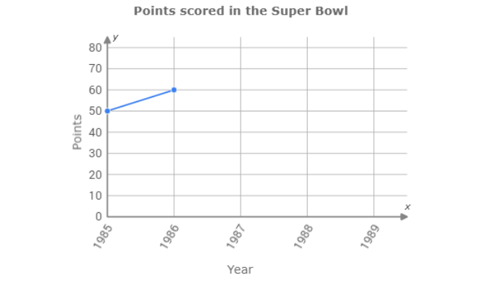
Fill in the rest of the graph the same way.
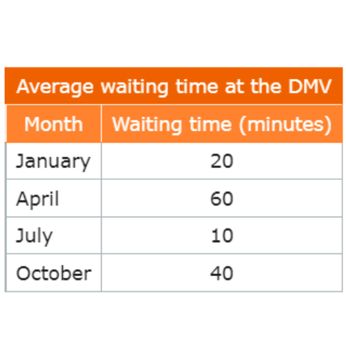
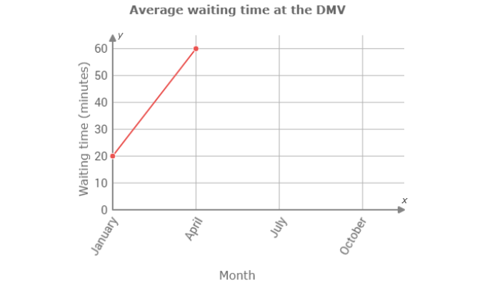
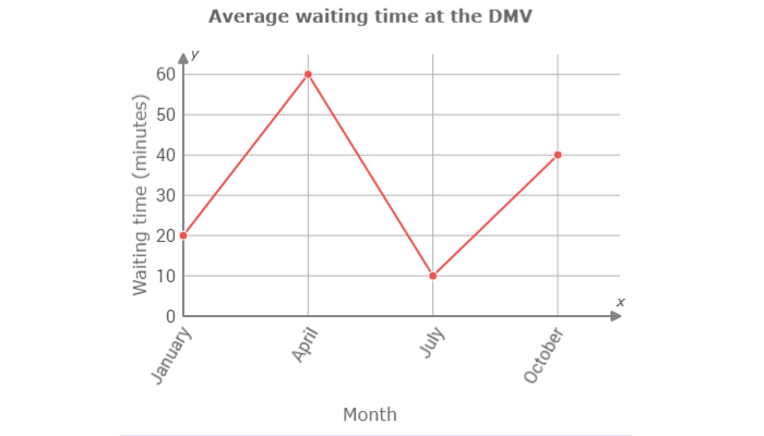
⚫ An administrator at the Department of Motor Vehicles (DMV) tracked the average wait time from month to month.
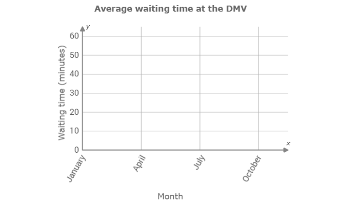
Use the data in the table to complete the line graph below.
Click to select points on the graph.
Look at the first line of the table. The first data point is for January. In January, the average waiting time was 20 minutes. Above January, click on the line for 20.
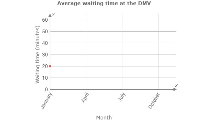
Now look at the second line of the table. The second data point is for April. In April, the average waiting time was 60 minutes. Above April, click on the line for 60.
Fill in the rest of the graph the same way.
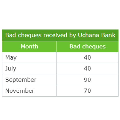
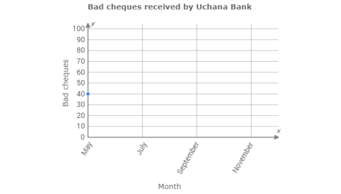
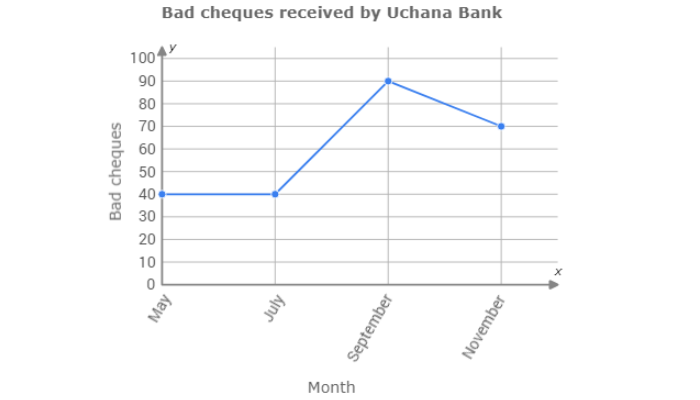
⚫ In a report to its board members, the Uchana Bank manager pointed out the number of bad cheques received.
Use the data in the table to complete the line graph below.
Click to select points on the graph.
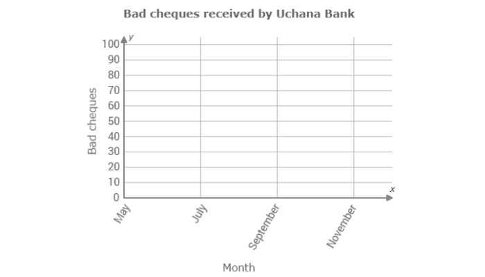
Look at the first line of the table. The first data point is for May. In May, the bank received 40 bad cheques. Above May, click on the line for 40.
Now look at the second line of the table. The second data point is for July. In July, the bank received 40 bad cheques. Above July, click on the line for 40.
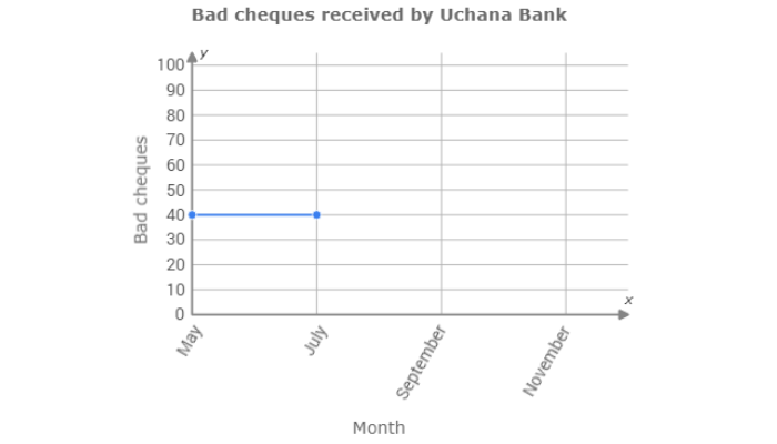
Fill in the rest of the graph the same way.
Let’s practice!🖊️